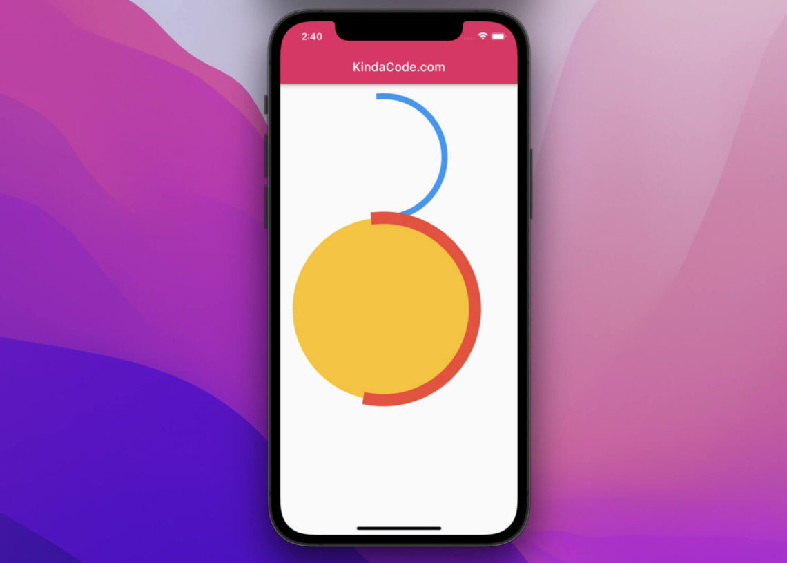
Progress Indicator states the time required for the task to finish. These tasks could be installation, uploading, downloading, file transfer, and many others. These Progress Indicators show the progress of the task completed. It also displays the length of the process or the task to complete.
What Is Circular And Linear Progress Indicator?
Normally, Flutter displays the current running progress in 2 different methods, such as CircularProgressIndicator and LinearProgressIndicator. Both of them are used for informing users about the status of ongoing progress. These could make users easily hold for a while as the task is in progress.
This task could be uploading, file transfer, downloading, and many more. During the Flutter business app development, it is necessary to use the CircularProgressIndicator or LinearProgressIndicator to indicate the task is running. It allows the user to easily understand the time taken for the task to complete.
Normally, the CircularProgressIndicator is a circular progress bar that could spin denoting the application is showing progress or busy. LinearProgressIndicator is also called as the progress bar that shows the progress of the task in the linear direction.
CircularProgressIndicator in Flutter:
For Leading Flutter Development Companies in UK like Flutter Agency, make sure while developing the App using Flutter technology, first it is necessary to add the API accordingly with the best operation. It is quite an efficient option for adding the Circular Progress Indicator to your app. They look quite stylish and allow the user to know that the task is in progress. It is also quite a convenient option for changing the color of the Circular Progress Indicator without any hassle.
How To Change The Color Of Circular Progress Indicator In Flutter Using The Valuecolor Property?
Adding the Circular Progress Indicator is one of the best ways to easily let the user know that something is happening in the background. There are also many methods available for easily changing the color of the Circular Progress Indicator.
Upon changing the color of the Circular Progress Indicator on your page, you could easily find them interesting. You could see that they would appear in the changing color. To change the circular progress indicator color in Flutter, using the valueColor property, it would be a suitable option for getting the Circular Progress Indicator.
- Access CircularProgressIndicator
- Add valueColor property
- Assign AlwaysStoppedAnimation()
- Add color of your choice
- Inside AlwaysStoppedAnimation()
- Change the background color of the CircularProgressIndicator
- Add the backgroundColor parameter
- Set it to the preferred color
For example, when you are adding blue color to CircularProgressIndicator then it would be denoting the changed color as a result.
CircularProgressIndicator(
backgroundColor: Colors.black26,
valueColor: AlwaysStoppedAnimation<Color>(
Colors.black, //<– SEE HERE
),
),
Types Of Progress Indicators:
These 2 Types of progress indicators, such as the Indeterminate and Determinate provide the result for various progress. The features of indeterminate progress do not have a specific value in any instance. It is specially made to indicate the number of progress remains.
Value property is useful for creating the indeterminate progress bar. The Determinate progress indicator has a specific value at each time. They indicate progress in a unique way. Normally, the value will increase monotonically from 0 to 1.
The term 0 indicates the progress started, but the term 1 indicates the progress is completed. For indicating the waiting process in application, displaying the progress indicator is quite necessary.
The circular Progress Indicator is an amazing and suitable widget. These would automatically display progress in a circular shape. LinearProgressIndicator is another alternative to this widget, but they would display in a linear manner.
Step 1: Using Valuecolor Property:
CircularProgressIndicator(
valueColor: new AlwaysStoppedAnimation<Color>(Colors.blue),
),
Step 2:
Add the accentColor in the MaterialApp widget. The process is quite simple with the MaterialApp widget as they would provide you with the superior option for flutter business app development. There is no need to set the color of the widget all the time as you can easily follow this simple step in the MaterialApp widget.
MaterialApp(
title: ‘My App’,
home: MainPAge(),
theme: ThemeData(accentColor: Colors.blue),
),
Step 3: Using Theme Widget
When you are using the Theme Widget, it is quite a convenient option for changing the color of the Circular Progress Indicator. Follow the below steps to achieve a great result.
data: Theme.of(context).copyWith(colorScheme: ColorScheme(
primary: Colors.red,
// You should set other properties too
)),
child: new CircularProgressIndicator(),
)
A Quick Method For Changing CircularProgressIndicator With ColorScheme Class:
Changing the circular progress indicator color is a much more simple and more efficient option. For changing the circular progress indicator color, it is quite an efficient option for choosing the ColorScheme class. These are specially made with more than 25 colors based on the 3 design materials. Mainly, ColorScheme class is helpful in defining the colors for your app.
- Locate the file MaterialApp
- Open ThemeData
- Add the colorScheme parameter
- Assign the ColorScheme.fromSeed().
- Open ColorScheme.fromseed()to automatically generate a Color scheme based on the material 3 design.
- Assign color
- See whether the color of the CircularProgressIndicator matches your design
- Add one more parameter called primary
- Assign a color of your choice
Changing Color Feature WithMaterialApp:
MaterialApp(
title: ‘Flutter Demo’,
theme: ThemeData(
primarySwatch: Colors.blue,
colorScheme: ColorScheme.fromSeed(
seedColor: Colors.greenAccent,
primary: Colors.greenAccent, //<– SEE HERE
),
),
home: CircularProgressColorDemo(),
);
CircularProgressIndicator(),
Creating Determinate CircularProgressIndicator:
Determining progress indicators is most important for you to easily pass the value properly. These values could range from 0.0 to 1.0. when the value is about 0.0, then you would have only 0% progress. But when the value is 1.0, then you can easily see the progress is 100%.
It shows that the circle is completely covered by the color of the progress indicator. Normally, the 0.2 value indicates that you would see it from the area covered by the progress indicator’s color. Variable _progress enabled with value meets all rules. It is quite an efficient option to pass a variable as a value by calling the constructor.
CircularProgressIndicator(
value: _progress,
)
Adding the accentColor is a suitable option for the foreground color of Widgets. The process is a better way to change the color of any foreground widgets. These include the circular progress bar
void main() => run app(
MaterialApp(
title: ‘Demo App’,
home: MainClass(),
theme: ThemeData(accentColor: Colors.black),
),
);
Conclusion:
In the above, we learned how to change the color of the Circular Progress Indicator. Adding the CircularProgressIndicator as it is and then the way to change the color in your Flutter app is explained above.


